Welcome to my blog for my A2 Media Studies coursework. With Hayley Pitcher, we have planned and created a 5 minute pyschological thriller entitled 'Mind Trap', which focuses on the life of Lucy, a teenager suffering from schizophrenia. As well as this, we have created two anciliary products; an audio advert that would be fit to broadcast on the radio and a poster to advertise our film to our demographic.

Note: all images in posts can be seen in a full-sized version by clicking on them.
Showing posts with label Poster. Show all posts

Wednesday, 23 February 2011

23rd Fedruary 2011

After finishing our poster some time ago, we have shown it to various people and asked what they thought of it. While they said that the composition of the shot was excellent and the use of Photoshop was both appropriate and well-done, most of them said that the title of the film needed to be bigger and needed to stand out more.
With this advice in mind, I spent a night on Photoshop, downloading suitable fonts (we are not allowed to download fonts on the school computers, which meant that we had to use the default fonts) until I found a font that looked good on the poster.
Here is the final poster:


Although we didn't change much, the poster now looks much more professional and the font that I chose aptly conveys the jumbled mess that is Lucy's mental state. It is rare that a film poster uses a stock font, so it was important that we changed it to make it look better. Both Hayley and I are happy with this draft of the poster, so I don't think that we will be doing anything more to it. Instead, we will focus on getting audience feedback on the film and finishing the final cut before the deadline.

Wednesday, 15 December 2010

15th December 2010

This week, we chose a photo from our most recent shoot and made the poster. We were able to make the poster relatively quickly because we are used to using Adobe Photoshop, as we both used it last year for our coursework and we both use it in our spare time.


(Click the poster to see a full-sized version)

We decided a dark theme would be the most appropriate for the genre of the film, so we used black to add a dark edge to the poster and used white for the text to make it stand out.
the high camera angle worked well for us, as it made the character look vunerable, and the acting of Hayley was excellent, as she looks genuinely scared and looked 'trapped' by the fence by the way she is holding onto it.
We focused on the eye, seeing as it is an occuring theme in this genre of film; 2 of the film posters were looked at emphasised the eye, and the brightness of the eye contrasts against Hayley's pale skin.
Overall, we are pleased with the poster; we think that it reflects the grene well, it gives just right amount of plot away without giving away too much, and it looks professional.

Wednesday, 8 December 2010

8th December 2010

We decided to have a final go at our photos for the poster, and these ones turned out well. Again, we decided to do exterior shots, considering the fact that most of the film is shot outside. We didn't think that using the same costume and location as in the poster was important and the exterior of the photo isn't that important, and most of the time on film posters, the costume isn't the same as it is in the actual film. Despite this, we decided to use a costume that was similar to create the same dark and hostile vibe as the film.
Below is a link to the album: http://s1143.photobucket.com/albums/n621/rosies13/Mind%20Trap%20-%20Poster%20Shoot%203/

Monday, 22 November 2010

24th November 2010

The second shoot, although in focus, also didn't really reflect our genre. Again, these photos look more like they belong to a mystery film rather than a psychological thriller. Even though shooting against a white background would make it easier to edit, we decided that the gloomy weather would help reflect the kind of sombre look we are trying to achieve.

Below is a link to the album:
http://s1143.photobucket.com/albums/n621/rosies13/Mind%20Trap%20-%20Poster%20Shoot%202/

Wednesday, 10 November 2010

10th November 2010

Before the shoot, we brainstormed some ideas about our poster:


The photos we took in the park on the 3rd November didn't come out as well as we planned, so we plan to take some more later. They were not in focus properly; this is disappointing as the shots were good, but I wasn't very experienced at taking photos using an SLR camera. These are shown below.
However, we did a rough edit of our radio advert and we have also started editing our film on Final Cut.

Below is a link to the album with the photos in: http://s1143.photobucket.com/albums/n621/rosies13/Mind%20Trap%20-%20Poster%20Shoot%201/

Wednesday, 6 October 2010

6th October 2010

This week, we started to focus on one of our smaller production tasks; the poster advertising the film. We decided to look at some posters for feature films that we liked the look of and analysed them:

Film Poster 1: The Happening


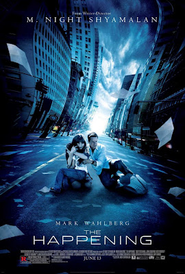
We thought that this poster was very effective. We liked that way that the background is distorted, giving the poster a sense of mystery and a sense of the unknown. The mise-en-scene is also very effective, giving the illusion that the city is like a ghost town, giving of an air of enigma. Also, the low-key lighting - a typical feature of this genre of film - helps the poster look mysterious. The way that the characters are positioned makes the film look scary, as the woman is holding the child in a protective way, as if sheilding it from evil. We plan to use this type of acting in our poster; we will use facial expressions to make the character of Lucy look afraid.


Film 2: WAZ


We liked the way that the emphasis is put on one side of the face, while the other side is in a shadow, making the character look scary and mysterious. Also, the emphasis on the eye makes the poster look chilling. We liked the typography used for the title, which has connotations of the writing of person who perhaps has a frazzled mind, like Lucy in our film. From this poster, we learnt that having quotes from reviews is alos quite important because if the auidence sees a good review, they are more inclined to see the film. Also, a chilling tagline might be good idea for our film, as it draws the audience in and suggests a sense of enigma. We need to think of an appropriate tagline for our film; something that will hint at the plot just enough so that the audience can tell what the film is about, but not too much so it creates mystery.


Film 3: Murderer


Although this film is a foregin film, we liked this poster very much. The evil smile is very effective in making the poster look scary and - like in poster 2 - the fact that half of the face is hidden makes the chracter look more menacing and mysterious. The fact that the character seems to be looking round the side of a wall suggests that he is hiding or perhaps syping on someone, which can relate to our film. The strong use of red and black make the poster very noticable, drawing in the attention of audience. This is something that we can use in our poster; we can use dark colours not only to make the poster look menacing and dark, but it can alos be used to draw in the audience.

From analysing these 3 posters, we have learnt that the composition and the mise-en-scene of the shots are very important as they can give key clues to the audience about the plot and the genre. Furthermore, the lighting is alos quite important. Low-key lighting creates a sense of enigma, which would work for our film, as the audience doesn't know the Lacus is actually real and isn't a figment of Lucy's broken mind.